As some of you may be aware, Grease Monkey had a lengthy publishing history before it landed here at this website. It made print three times during the 1990s, starting with the first chapter and going as far as possible before circumstances brought the experiment to a close. This experience brought me valuable insight into the workings of the comic book business and made some things possible that might not have happened otherwise. Here then is a brief rundown of what went on during those strange years.
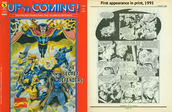
The very first publication to give Grease Monkey a shot was a now-defunct Canadian magazine called Up’n Coming. It was actually a monthly catalogue from a distribution company called Styx International, run chiefly by two magnanimous gentlemen named Joe Krolik and Brent Richard. It was Brent who got it all started when he asked me in 1992 if I had anything that might work as a monthly feature in the catalogue. By a staggering coincidence, I’d just finished drawing the first chapter and it turned out to be a match made in heaven.
We agreed that I would write and draw six chapters of Grease Monkey at 12 pages apiece, and Styx International would use them to draw more attention to Up’n Coming. I should explain that this was quite a different time for comic book distribution, with many companies of varying sizes providing the vital link between publishers and store owners. Each of these distributors offered slightly different services and made it possible for comic books to penetrate widely into a large number of specialty shops.
All that changed in the mid 90s when the second largest of these companies, Capital City, was bought out by Marvel Comics. This severely handicapped the ability of many small independent publishers to get their comics properly distributed. It created a domino effect of shutdowns that resulted in the largest distributor, Diamond Distribution, coming out on top with an effective monopoly on the entire business. They’re still on top today, Marvel’s attempt to become its own distributor was unsuccessful, and alternative companies like Styx International are long gone. I still consider myself extremely fortunate to have connected with them before all of this came about, since it gave Grease Monkey its first push.
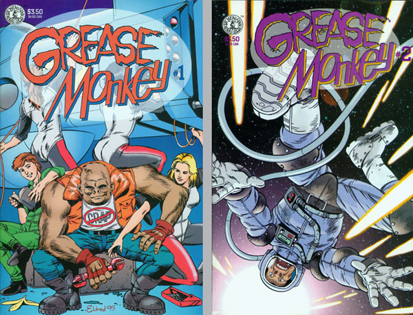
The next home for the strip came from an actual comic book publisher (also now defunct) called Kitchen Sink Press. Well-respected at the time for their eclectic variety of beautifully-produced titles, this company was the brainchild of Denis Kitchen, one of the wisest and friendliest visionaries ever to step into the fray of art and commerce. I showed the six chapters of Grease Monkey to Denis in 1994, and in he expressed an interest in reprinting them in a 2-issue miniseries (3 chapters per book). Because they were already written and drawn, he took the additional step of commissioning me to color them, which made possible the color chapters you see in Book 1.
The 2-issue Grease Monkey miniseries was published by Kitchen Sink in 1995 to great critical acclaim but not-so-great sales figures. The distributor implosion was knocking a lot of comic stores out of business, and others were cutting back on what they were willing to carry. However, Kitchen’s Hollywood connections were already laying the groundwork for my next career in animation – another story entirely.
I’d been given a chance to re-examine the art in the first six chapters and some of it left me, quite frankly, horrified. I didn’t mention before that I had a lot of other comic book projects going on in the early 90s. This forced the quality of my work to improve rapidly. On average, I was drawing about six months ahead of publication, which meant that by the time issue 1 of something came out, I was already drawing issue 6. It was not uncommon for me to page through a fresh copy of that issue 1 and wonder what the hell I was thinking when I drew all those distorted bodies and wonky faces.
Two full years had gone by since I’d drawn the first six chapters, and they were full of ugly art that now needed to be upgraded. Fortunately (or unfortunately as the case may be), I still have access to that earliest version, from which I have assembled the gallery below. They’re just about as embarrassing as a yearbook photo, but I’m willing to share them for the sake of education.
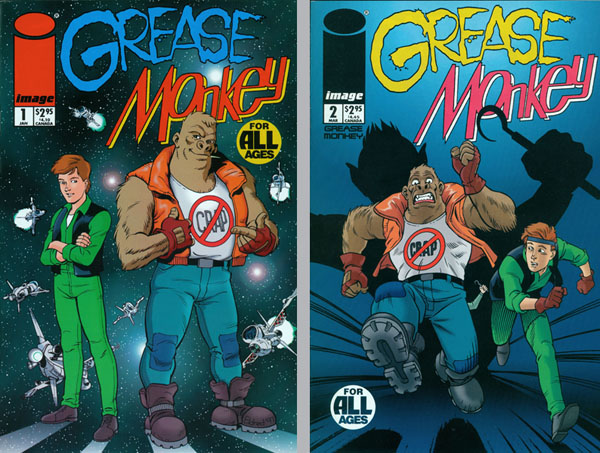
Jump forward a couple more years, and I found myself approaching another publisher, this time one that’s still with us: Image Comics. I’d never been a huge fan of theirs since (in the early years) they mostly seemed preoccupied with derivative superhero characters, but my friend Kurt Busiek kept nudging me to call them up anyway, insisting that they were looking for new stuff to widen their appeal. This got me in touch with artist/writer/publisher Jim Valentino, who was about to debut his own line of black and white titles. Jim decided at a glance to make Grease Monkey one of them.
The budget wasn’t there to reprint the color version, but the series would get another chance to be seen and I’d have yet another opportunity to go back in for some art cleanup. Jim asked me to consider picking up where the Kitchen Sink edition left off, but I felt strongly about giving readers chapter 1 all over again in case they’d missed it before. The first issue of the Image edition came out in January 1998 and was followed by issue 2 in March. Each issue contained two chapters this time. Issue 3 was to follow in May, but low sales prevented it from seeing the light of day. (By this time, the distributor implosion was in full swing and nobody wanted to take a chance on anything that didn’t have a pre-sold audience.)
Despite this setback, I decided to keep going anyway. I had a lot of ideas for new chapters and I wasn’t going to let a little thing like cancellation stop me from writing & drawing them. By this time, a career in animation had replaced my career in comics, so I decided to lavish all my free time on the Grease Monkey without worrying about who would eventually publish it. The result of this decision was Book 1.
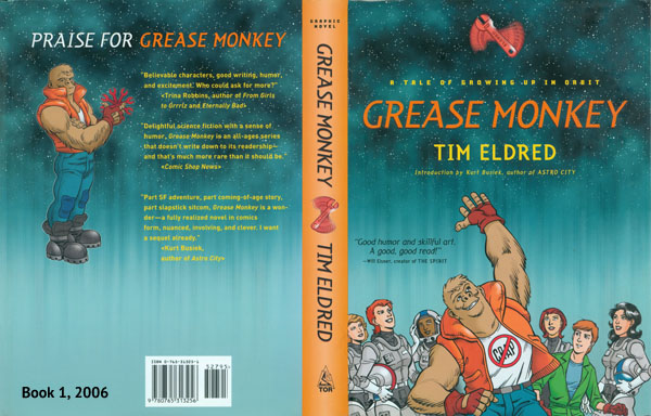
Grease Monkey: A Tale of Growing up in Orbit was published in May 2006 by Tor Books. (The story of how I hooked up with them is told here.) They opted not to publish the color versions of Episodes 1-6, so those were converted to greyscale. Fortunately, you don’t have to pay for color ink on a website, so they appear in color here. The rest of the book was all black & white from the start; Episodes 13-18, three vignettes, and some text features – all of which are now part of this site. The cover art was new.
The first edition was a gorgeous hardcover that still impresses me whenever I pick it up, just for its sheer solidity. It was only the second time my work ever made it to hardcover, following a graphic novel by Daniel Quinn titled The Man Who Grew Young (Context Books, 2001). It may not be a big deal in the publishing world, but it definitely is in comics. A softcover was published a year later, right around the time Grease Monkey was named a “Best Book for Young Adults” by the American Library Association in 2007.
Both editions are out of print now, but once in a while someone will send me a photo of a copy they spotted in a library or used bookstore, and I’m reminded that my characters are off in the wide world making friends of their own.
It was a long, strange trip that could have ended early if any one thing went differently. I hope you enjoyed reading about it! Now for those yearbook photos…
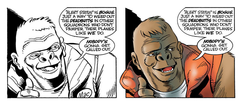
As you continue drawing a character over the years, his design naturally evolves as you find your comfort zone. Mac’s face, for example, lengthened and gained more symmetry. These panels are from Episode 5. Left: 1992. Right: 2002.
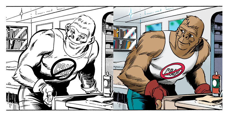
From Episode 6. Mac’s body also went through some changes, gaining more fur and definition. Left: 1992. Right: 2002.
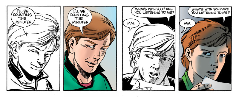
This two-shot from Episode 2 shows both Mac and Robin evolving together. It took three tries to get Mac’s expression just the way I wanted it. Left: 1992. Center: 1994. Right: 2002
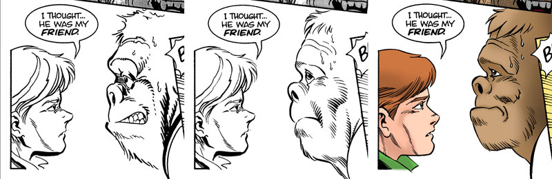
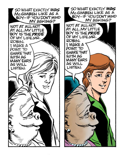
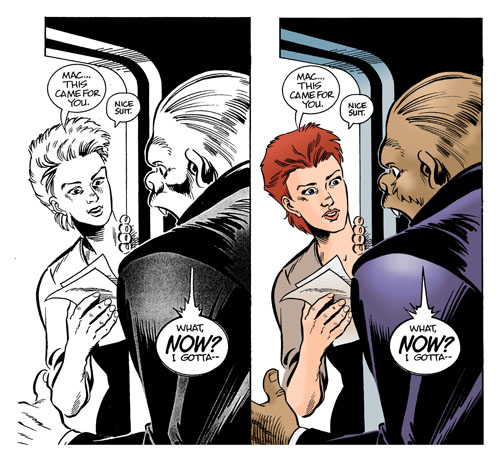
Robin’s design changed even more than Mac’s did, becoming much more consistent and refined. Now I view some of those early drawings as Robin’s “stand in,” some kid who tested well but didn’t land the part. Left side: panels from Episode 1. Right side: panels from Episode 5. Ten years passed between each drawing.
Panels from Episode 6. Again, that’s Robin’s ugly stand-in on the left (1992) and the “real” Robin on the right (2002)
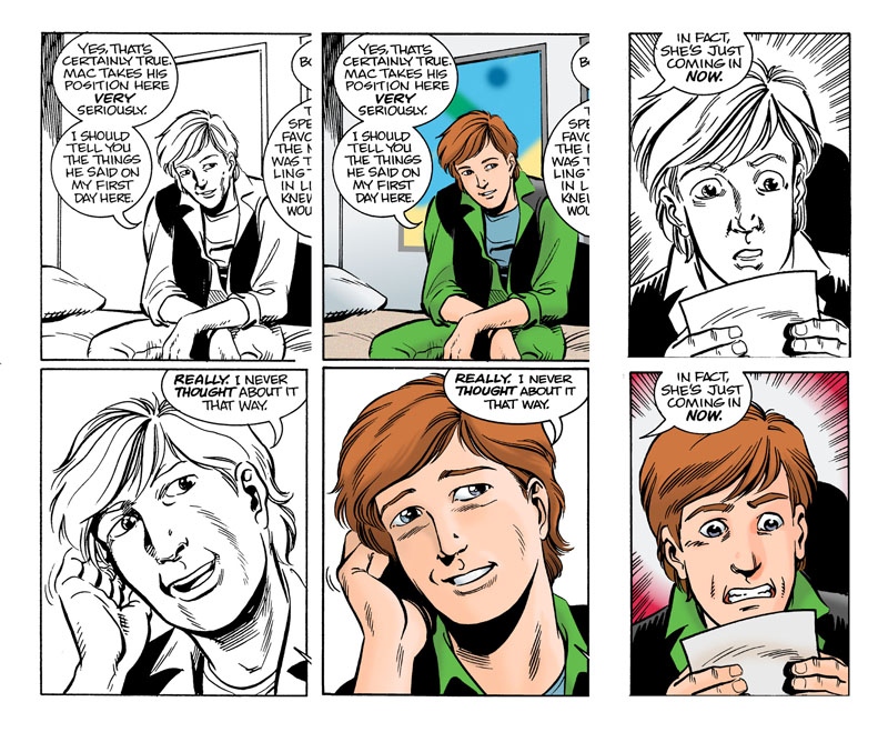
More panels from Episode 6. Robin’s stand-in has obviously spent too much time in the company of gorillas, since he’s starting to look like one. Black & white: 1992. Color: 2002.
Drawing highly feminized comic book women has never been my strong suit. Instead, I’ve always tried to stay firmly grounded in reality, where “normal” women far outnumber the busty Amazons that overpopulate the comic book world. Most of my early drawings of the Barbarian pilots show how much I struggled with this, often making them too masculine. Here’s Barbara’s first appearance in Episode 1. Top: 1992. Bottom: 1994.
Here she is at the end of Episode 1, looking more manly than the guy she’s about to shoot down. Top: 1992. Bottom: 1994.
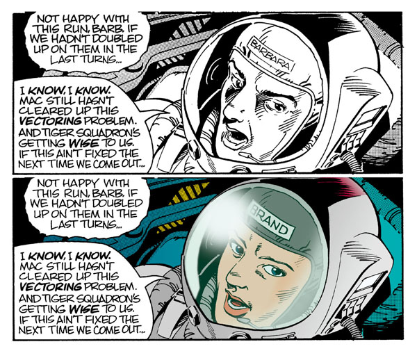
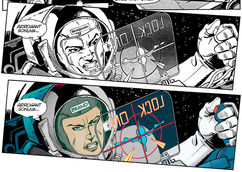
Here she is again in Episode 6. I don’t think anyone could mistake her for a male in the first drawing (1992) but you can see a lot of improvement in the second drawing (1994).
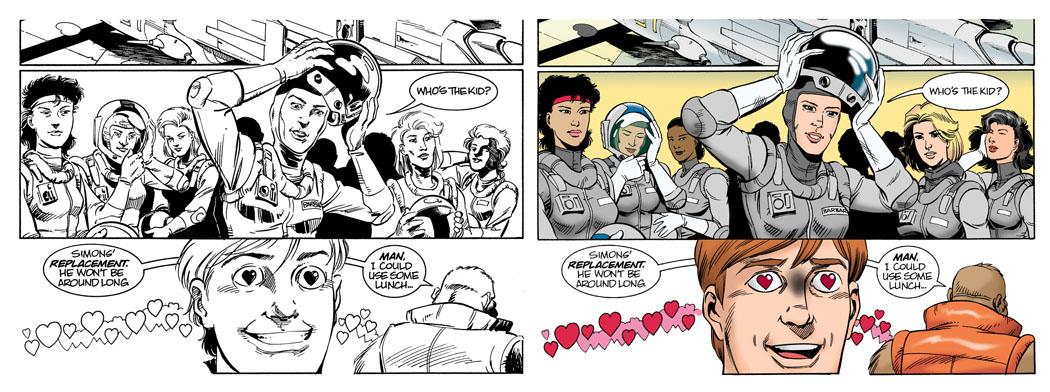
The first reveal of the Barbarians in Episode 1 was supposed to knock everyone’s socks off. (Surprise–they’re all gorgeous women!) And though Robin seems impressed, I was not when I went back and re-examined it. Even the boy needed a face lift in this scene. Left: 1992. Right: 1994.
In these panels from Episode 1, my complete failure to take any figure drawing classes is evident at the left (1992). Two years of steady work made a big difference when I redrew it in 1994.
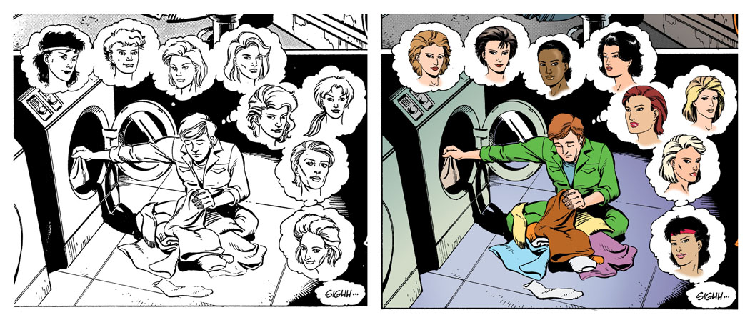
A lovesick Robin daydreams about all the Barbarians, except Barbara for some reason, while doing their laundry in Episode 4. The headshots on the left side are all my original designs for the lady pilots from 1992. Again, two years were required for me to sober up and do them justice in 1994.
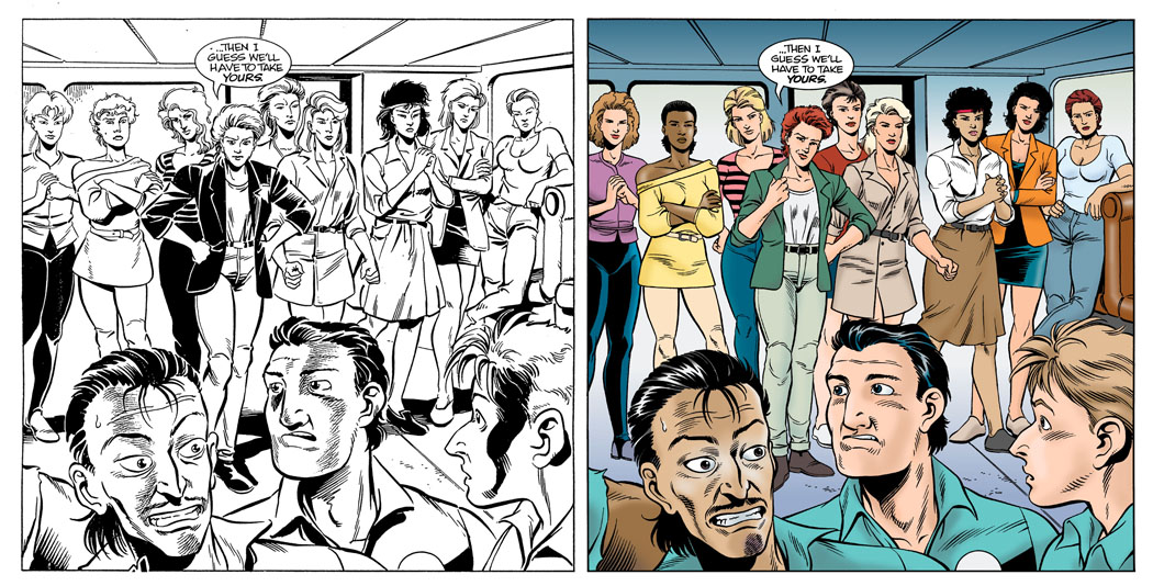
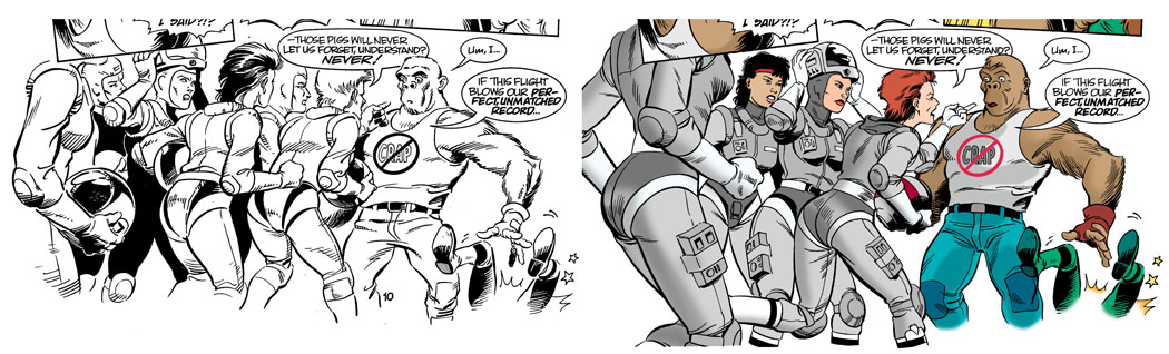
This one, also from Episode 4, is probably the mother of all Barbarian panels. As a connoisseur of monkeys and mecha, fewer things are harder for me to draw than a gang of highly individual women in contemporary clothing – but here they all are anyway. Left: 1992. Right: 1994. I make no apology for the fashions being rooted in the early 90s, since they will probably come back a few times between now and the distant future.